Service Blueprint vs User Journey Map: Why Fixing the Screen Won't Fix the Experience
A user journey map shows where an experience hurts, from the user’s side. A service blueprint adds the organization underneath it, showing why it hurts and who has to change. Use a journey map to align on what users go through, and a service blueprint when the same complaint keeps returning after the screen has been redesigned.

The frustration that survives the redesign
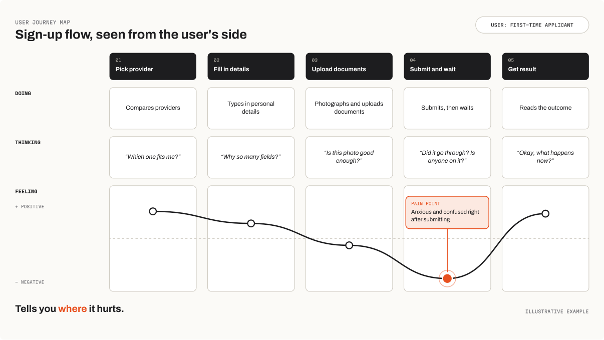
Picture a familiar scene. The journey map is done, it’s colorful, and it’s pinned on the wall. Step four is flagged red as a pain point: users get anxious and confused right after they submit their request. So the team redesigns that screen. Better copy, a progress indicator, a cleaner layout. It ships.
The pain point is still there.
That’s not a UI failure. The screen was never the cause. Somewhere behind it, two teams hand work to each other through a spreadsheet, and nobody knows who owns the delay. The user feels it on the screen, but the screen can’t fix it.
This is the gap between two tools that get confused all the time: the user journey map and the service blueprint. Designers often treat them as two versions of the same thing. They answer different questions, and picking the wrong one is a quiet way to spend a lot of budget on the wrong layer.
What is the difference between a journey map and a service blueprint?
A user journey map follows a person through an experience from their side. What they do, what they think, how they feel, where they get stuck. It’s built from the user’s perspective, and its strength is making a team feel the experience instead of just reading about it.
A service blueprint takes that same journey and adds the organization underneath it. It splits the work into layers: what the customer does, what staff do where the customer can see it (frontstage), what happens where they can’t (backstage), and the systems and processes that support all of it. The line between frontstage and backstage is the important one. Most experience problems live right below it.
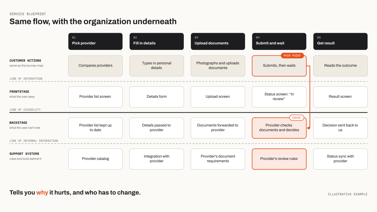
Here’s the simplest way to hold the difference:
- A journey map tells you where it hurts.
- A service blueprint tells you why it hurts, and who has to change something to stop it.
Which one do you need?
Skip the “which tool is better” debate. Start with the question your team is actually stuck on.
“We don’t really agree on what the user goes through.” Start with a journey map. It aligns the room around one shared picture of the experience, especially when different teams each hold a different (and usually partial) version of it.
“We keep fixing the UI and the same complaint keeps coming back.” That’s a blueprint problem. A recurring pain point that survives screen-level fixes almost always has a cause backstage: a handoff, a policy, a tool that doesn’t talk to another tool.
“The experience depends on several teams or departments working together.” Blueprint. Journey maps are blind to organizational boundaries by design. Blueprints put them on the page, which is exactly where the arguments about ownership need to happen.
“We’re early, the problem is fuzzy, and we have little time.” A lightweight journey map is usually enough to start. You can build a blueprint later, only for the one or two moments that turned out to matter most.
In practice the two work best as a sequence. The journey map finds the moments that hurt. The blueprint digs into the worst of them.
And if you’re still not sure which wider method these tools even belong in, I wrote a practical guide to choosing between Design Thinking, Double Diamond and Design Sprint.
What it costs to pick the wrong one
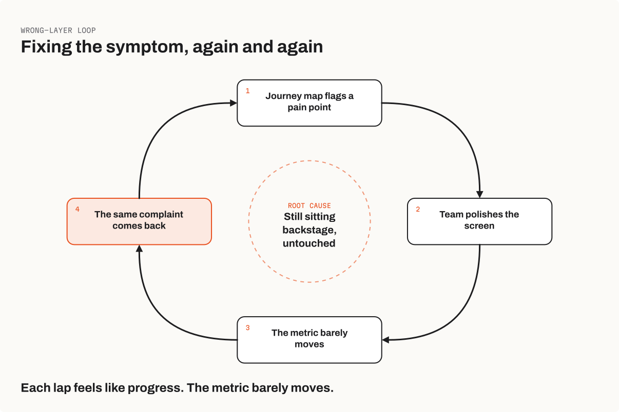
Using only a journey map on a problem that lives backstage is the expensive mistake. The map points at the symptom, the team fixes the symptom, and the cause keeps producing it. You can run this loop for months. Each round feels like progress because the screen really did get better, but the metric you care about barely moves.
Going the other way costs something too. Building a full blueprint when the team simply hasn’t agreed on what the user experiences is heavy for the job. You produce a detailed picture of a process nobody has validated.
And there’s a third trap that has nothing to do with choosing wrong: making either artifact without talking to the people involved. A journey map written in a meeting room is an assumption map. A blueprint drawn without the backstage owners in the room is a guess about how their work runs. Both end up as beautiful posters that nobody trusts.
Where I’ve seen this go wrong
On a past product, we put a lot of effort into making the sign-up flow as friendly and seamless as we could. Clear steps, plain language, a flow that never felt like a wall of forms. On the screen, it was about as good as that experience gets.
But a flow that ends in someone else’s approval has never been as easy as a good screen makes it look, especially from a phone. Our product sat in the middle as a third party. The user picks a provider, uploads the required documents, and then the real decisions happen on the provider’s side, under the provider’s rules. None of that was something we could fix with a better layout.
A journey map would have shown me a pain point right after the document upload and left it there. It took thinking in layers to see what was actually going on: the frontstage was smooth, but the experience was being set backstage, by verification requirements and a partner we didn’t control. Polishing the upload screen one more time was never going to change that.
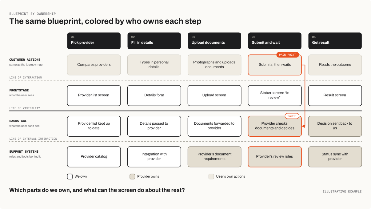
That’s when the question changed for me. Not “how do we make this screen better,” but “which parts of this experience do we actually own, and what can the screen do about the parts we don’t?”
The short version
A journey map and a service blueprint aren’t rivals. One shows the experience from the outside, the other shows the machinery that produces it. When the problem is understanding, reach for the map. When the problem keeps coming back no matter how many screens you polish, reach for the blueprint.
The screen is only the part of the service the user can touch. The work that decides how that touch feels often happens somewhere else.